Blogging 101 is a series post where I talk about everything about blogging and today post would be about tips on how to make your blog beautiful and attract readers to stay. If you want to read more you can click on the blogging tips tab or click here. Welcome aboard!
Are you feeling bored with your current blog design?
You want to spice up your blog, rebranding it into something new and fresh but didn’t know how to do so?
Then, have a seat because this blog post is perfect for you.
So hi everyone! I’m here to share on the secrets on how to make your blog beautiful and attract readers to stay. Being a blogger, your blog design is one of the major deciding factors on attracting readers. Everyone has a different idea and aesthetic of what beautiful is but generally, people agree that having a nice looking, pleasing and easier to the eye blog design is a must.
I mean, just look at my blog? Isn’t it like one of the prettiest blogs that you’ve ever seen?#SelfLove #EveryoneStanAConfidentWoman
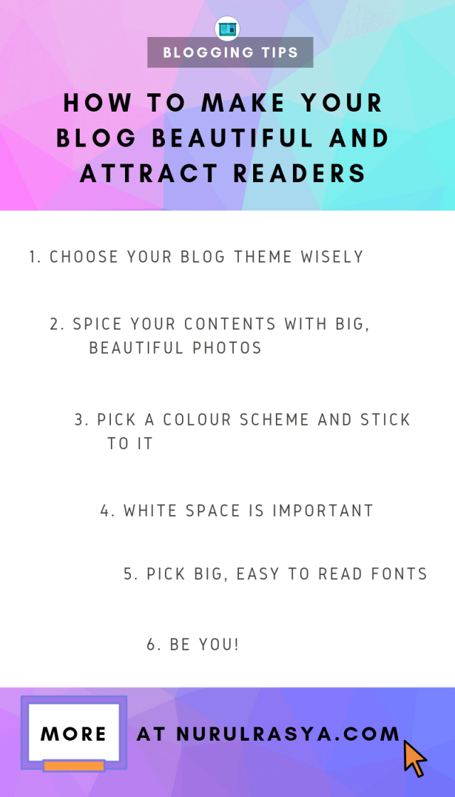
HOW TO MAKE YOUR BLOG BEAUTIFUL AND ATTRACT READERS
1. CHOOSE YOUR BLOG THEMES WISELY
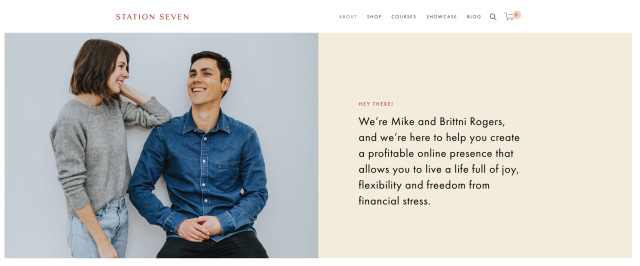
A blog theme is like your outfit. One look and people could gauge on what kind of person you are behind the screen and contents you’re going for. Pretty sure that a niche tech blog wouldn’t have scenic photographs or delicious looking cupcakes plastered around their blog, right?
So where could you get the best blog designs for your blog?
A quick Google search would give you a plethora of sites but here is my recommendation for best sites to buy or get quality blog themes.
Many designers to choose for and all of them are so mouthwatering pretty and that is why all of my blog themes are bought from here. 100% recommended.
Never use their service but their themes are nice 👍
One of the most beautiful feminine blog designs that I have ever seen and that says a lot as I’ve seen many from all of my years of blogging. Lifestyle, beauty and fashion bloggers would love their themes but the downside is, the price is hella expensive.
Clean, minimalist design. Cater to both WordPress and Squarespace users.
You probably already know about how cheap and affordable the blog themes on Etsy and the best things is that you can find blog themes for both WordPress and Blogger users which is an A+ in my book.
Feminine, lifestyle and beauty bloggers would love Creative Market. Just like Etsy, there are a lot of blog designers selling their themes at this site.
Initially, I want to put Pipdig too but after reading the whole Pipdig fiasco on Twitter of them putting questionable codes in their themes and plugin codes, I decided to not put it here. Of course, if you’re bloggers who use Pipdig theme or hosting service, I wouldn’t say anything about it as it’s your choice and it’s not easy to change blog themes but I’ve to admit that what they did look sketchy.
For free themes, I wrote a blog post about it which you can read here.
12 Awesome And Free Responsive Blogger Templates
And Wana, a blogger friend who design and write codes for her WordPress.org and Blogger.com’s blogs which is #awesome also generously give free Blogger themes and HTML/CSS class. Go check her blog here.
Some tips to look at when choosing your blog themes.
- Mobile-friendly
I couldn’t help but sigh when I see bloggers who blog design are not mobile-friendly who share their link during Twitter chats/Instagram. It’s hard to read the contents as the design is for the desktop which totally has different screen resolution.
Let’s be real here. Who on earth opens Twitter or Instagram on their computer or pc? - Easy to customize. For us who are not equipped with tech knowledge, coding is daunting. I could do some basic HTML and CSS but anything beyond that would make my head hurts.
- Clean code.
- Has documentation.
- Great customer service support from the seller.
- Lightweight for fast loading. Ideally, your blog should take no more than 3-5 seconds.
- Affordable. Watch out for the discounts and sales. Especially during Black Friday. You could save tonnes of money and get yourself a premium blog design.
- You must like it! Obviously 😂
2. SPICE YOUR CONTENTS WITH BIG, BEAUTIFUL PHOTOS
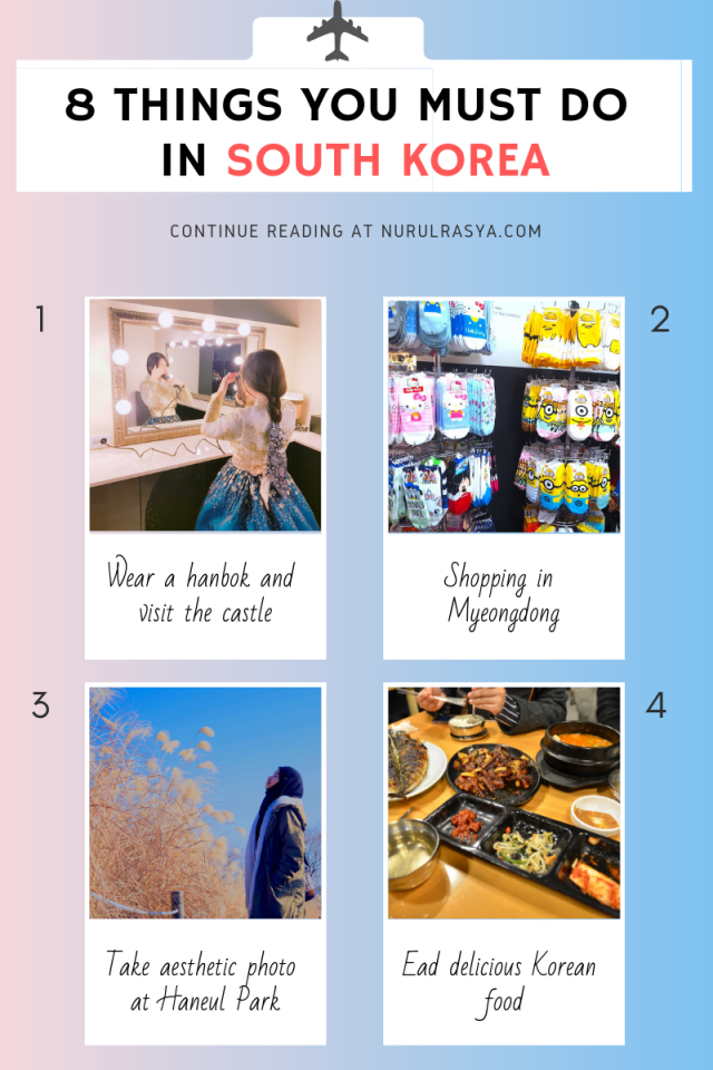
With social media being popular as ever, our attention span, unfortunately, becomes shorter so adding photos to your contents would visually appeal to readers’ eye and add some flair to your posts. If taking photos is a hassle you can find quality photos at free sites like Unsplash, Pexels and Pixabay.
You can also add gifs!
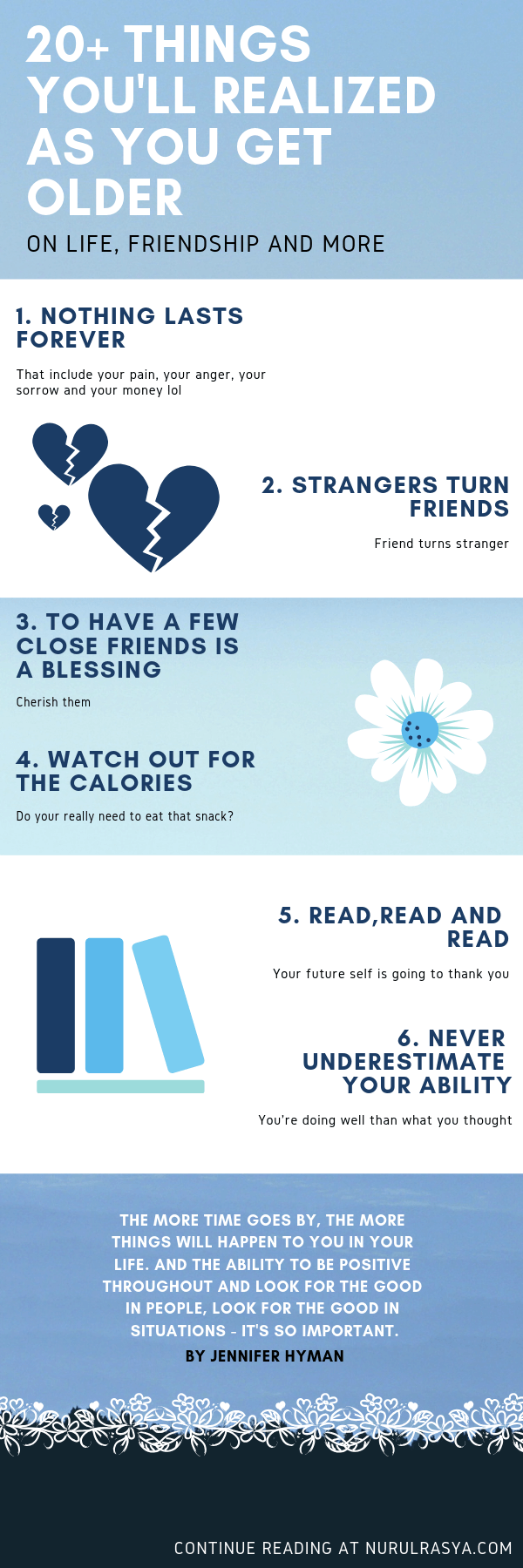
Or infographic.
I create mine by using Canva.
Related: How To Create Pin-Worthy Blog Graphics By Using Canva (With Video)
Little tips: Make sure that the graphics; photos, gifs etc. match with your blog posts.
3. PICK A COLOUR SCHEME AND STICK TO IT
If you look at my blog, you’ll know that I’m a pastel blue and pink colours lover. Having a set colour scheme is crucial for your brand. It would be the colours you use for your blog graphics, header and design.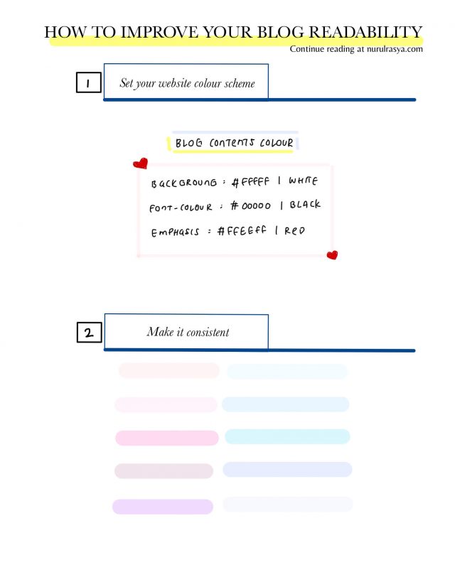
For more of colours inspiration, Pinterest is your friend. I could spend hours browsing from design to typographic tips on Pinterest. Who’s with me? 🙋♀️
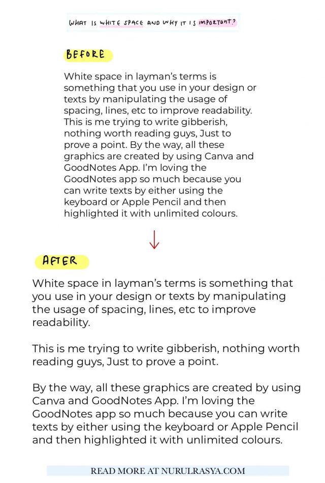
4. WHITE SPACE IS IMPORTANT
White space in layman’s terms is manipulating the use of spacing, lines, etc. when creating design or texts.
Canva wrote a great and detailed explanation on white space which you can read here.
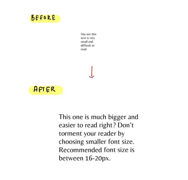
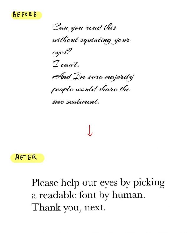
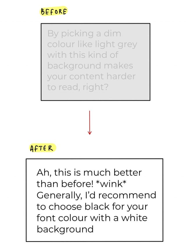
5. PICK BIG, EASY TO READ FONT
With fonts, you just need to make it readable.
One by choosing the right font size.
Second is the font type used.
Three is the font colour.
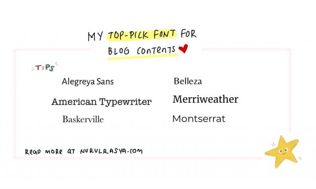
If you’re clueless to pick on what font to use for which is totally understandable as there are so many pretty fonts from Google Fonts, I’d suggest sticking to the traditional or sans-serif type fonts like Montserrat or Open Sans. Here is my top pick font for blog contents. Mine is Belleza by the way.
6. BE YOU!
A friendly reminder, people need to remember that having a beautiful blog design is like a gate to attract new readers to stay and read your contents, but to make them stay for a long time, your content is the answer.
What do you guys think? Any tips or suggestions to add?
Follow me on:
Follow
Follow Nurul Rasya on WordPress.com






22 comments
hai kak rasya, i am here reading your post to complete my nilam book (we have to read at least 40 for these 2 months, haih, tak silap.) and i just randomly picked your posts from archive and guess what, i found out that this post is really really jinja wanjeon real heol daebak useful. ok hahaha thanks for this. it does help me a lot. if you have any free time, would you mind to visit my blog and give some advices about blog design ?? I’m your big fan , sis hehehe.
Aira
Omg thank you baby! I’ve visited your blog is beautiful! Love the header especially!